South Side Strong Summit
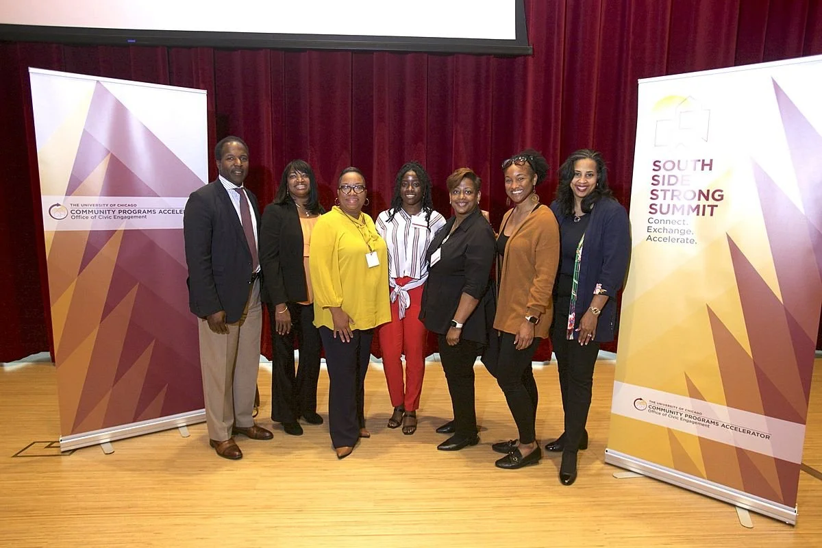
The Community Programs Accelerator (CPA) at the University of Chicago hosted its inaugural South Side Strong Summit, a pivotal event bringing together local nonprofit professionals and welcoming South Side nonprofit organizations into its 2022 cohort. To symbolize the unity and collective growth of the community, CPA sought a compelling banner and logo design that would not only represent their mission but also serve as a visual centerpiece for the event.
Client
the University of Chicago Office of Civic Engagement
Scope
Marketing
Year
2022
Design Concept:
The design concept centered around the imagery of mountains rising together, symbolizing the collective strength and growth of the community. The logo itself was integrated seamlessly into the overall banner design, reinforcing the message of unity. The color palette incorporated earthy tones and vibrant accents to evoke a sense of stability, growth, and vitality.
Objective:
The primary objective of this project was to create a banner and logo design that would embody the idea of a united and resilient community. The design needed to convey the concept of individuals and organizations coming together like mountains rising in unity, representing strength, growth, and community support.
Key Deliverables:
South Side Strong Summit Banner:
Design: A visually captivating and cohesive banner that prominently featured the mountain imagery and incorporated the event's title and date.
Size Variations: Various size variations suitable for indoor and outdoor display.
Material Selection: Recommendations for durable and high-quality banner materials.
South Side Strong Summit Logo:
Logo Design: A distinctive and memorable logo that combined the mountain motif with the event's name and a contemporary typography style.
Logo Variations: Versions of the logo for different applications, including digital and print.
Outcome:
The "South Side Strong Summit: Community Unity Banner and Logo Design" project successfully delivered a visual identity that conveyed the powerful message of community unity and growth. The banner served as a focal point during the inaugural summit, reinforcing the event's mission and creating a strong visual impact. The logo provided a versatile branding element that could be used for future events and promotions, ensuring continuity in representing the CPA's commitment to South Side nonprofit organizations.
Key Visual Elements:
Mountains rising together to symbolize community strength.
Energetic color palette with vibrant accents for vitality.
Clean and contemporary typography for readability and modern appeal.
This project not only met the immediate design needs of the South Side Strong Summit but also laid the foundation for a cohesive visual identity that could be carried forward in future community initiatives and events.


